 GitHub
| Home (Project)
GitHub
| Home (Project)
GitHub
| Home (Project)
GitHub
| Home (Project)
A chart of internal displacement in the DRC.
A chart of exports from the DRC.
2024's Festival of Economics featured the discussion, "The kids aren’t alright: Tackling a legacy of child poverty, bad diets and poor health." This topic inspired me to explore a key part of children's health - mental health.
The kids are indeed not alright, with probable mental health disorders increasing in England since 2017, experiences which tend to coincide with major family hardship.
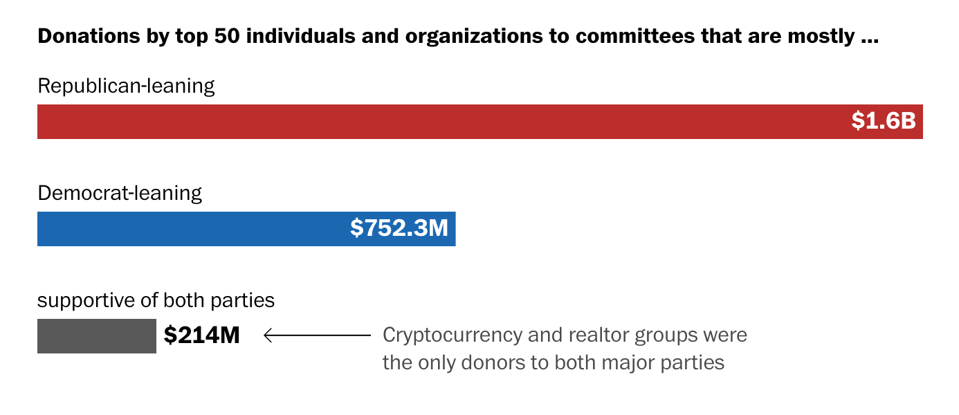
I scraped the data found on this Washington Post article and replicated the original visualisation. My new chart disaggregates donor info, explorable through tooltip.
I scraped the British Transport Police’s list of stations to retrieve crime data (specifically in TfL stations). I chose this site for its relevance to my project.
Jupyter notebook (step-by-step explanations). Colab notebook.
Map 1 is a base map of London boroughs. Map 2 shows the percentage of households throughout all London borough without access to a car or van (source: ONS, 2021 UK Census).
These two charts utilize ONS microdata via Davies (2021) to track the median yearly prices of two personal health items in the UK – tampons and vitamins. The price data was 1) merged with region data and then filtered for the target items and their median prices.
Interactive element: click on legend to isolate underground lines.
Interactive element: use the checkboxes to see extent of TfL's network. Hover over bike dock points for bike totals. Hover over stations/bus stops for names.